My last post, which covered an introductory example of adjusting century-old stats for inflation in the MLB, was the first step is a larger goal, one that will be brought to life with the processes I’ll outline today: ranking the greatest MLB players ever. Many times before we have seen an attempt to do so, but rarely have I found a list that aligns with my universal sporting values. Thus, I have chosen to embark on a journey to replicate the results in a process I see to be more philosophically fair: a ranking of the best players of all time with the driver being the value of their on-field impact. However, as I am a relative novice in the art of hardcore analysis in baseball, I’ll be providing a clear, step-by-step account of my process to ensure the list is as accurate as possible.
The Philosophy
I’ve come to interpret one universal rule in player evaluation across most to all team sports, which relies on the purpose of the player. As I’ve stated in similar posts covering the NBA, a player is employed by a team for one purpose: to improve that team’s success. Throughout the course of the season, the team aims to win a championship. Therefore, the “greatest” MLB players give their teams the best odds to win the World Series. However, I’m going to alter one word in that sentence: “their.” Because championship odds are not universal across all teams (better teams have greater odds), that means a World Series likelihood approach that considers “situational” value (a player’s value to his own team) will be heavily skewed towards players on better teams, and that would be an unfair deflation or inflation of a player’s score that relies on his teammates.
The central detail of my evaluation style will be the ideology behind assigning all players the same teammates, average teammates. Therefore, the question I’m trying to answer with a player evaluation is: what are the percent odds a player provides an average team to provide the World Series? This approach satisfies the two conditions I outlined earlier: to measure a player’s impact in the way that appeases the purpose of his employment while leveling the field for players seen as “weaker” due to outside factors they couldn’t control. Thus, we have the framework to structure the evaluations.
The Method
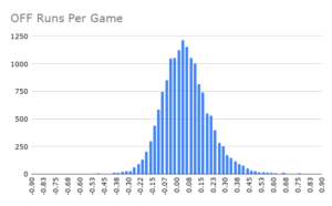
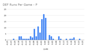
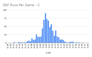
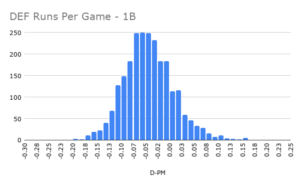
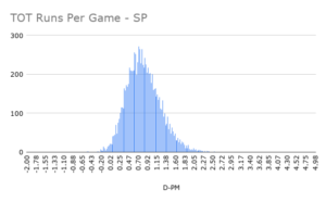
To measure a player’s impact, I’ll use a preexisting technique I’ve adopted for other sports, in which I estimate a player’s per-game impact (in this case, this would be represented through runs per game). For example, if an outfielder evaluates as a +0.25 runs per game player on offense and a 0 runs per game player on defense, he extends the aforementioned average team’s schedule-adjusted run differential (SRS) and thus raises the odds of winning a given game with the percent odds that come along with a +0.25 SRS boost. To gain an understanding of how the “impact landscape” works, I laid every qualified season from 1871 to 2020 out for both position players and pitchers to get a general idea of how “goodness” translates to impact. These were the results:
Note: Offense and fielding use Fangraphs‘s “Off” and “Def” composite metrics scaled to per-game measures while pitching uses Runs Above Replacement per game scaled to “runs above average” – these statistics are used to gauge certain levels of impact. / I split the fielding distributions among positions to account for any inherent differences that result from play frequency, the value of a position’s skill set, and others.
Offense (all positions)
Fielding (pitchers)
Fielding (catchers)
Fielding (first basemen)
Fielding (second basemen)
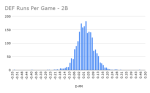
Fielding (third basemen)
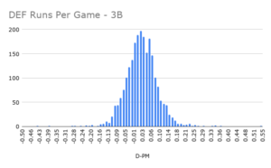
Fielding (shortstops)
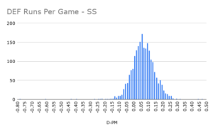
Fielding (outfielders)
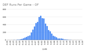
Pitching (starters)
Pitching (relievers)
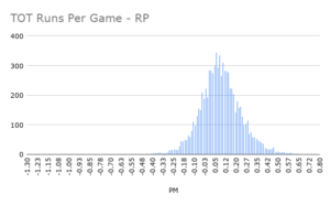
A large reason for the individual examination of each distribution is to gain a feel for what constitutes, say, an All-Star type of season, an All-MLB type of season, or an MVP-level season, and so on and so forth. The dispersions of the distributions are as listed below:
| Standard Deviations | Position Players (Off) | Starting Pitchers (Pitch) | Relief Pitchers (Pitch) | Pitchers (Field) | Catchers (Field) | First Basemen (Field) | Second Basemen (Field) | Third Basemen (Field) | Shortstops (Field) | Outfielders (Field) |
|---|---|---|---|---|---|---|---|---|---|---|
| -4 | -0.554 | -1.683 | -0.582 | -0.305 | -0.262 | -0.255 | -0.256 | -0.258 | -0.258 | -0.286 |
| -3 | -0.402 | -1.262 | -0.437 | -0.233 | -0.183 | -0.202 | -0.185 | -0.188 | -0.178 | -0.221 |
| -2 | -0.250 | -0.841 | -0.291 | -0.162 | -0.104 | -0.149 | -0.115 | -0.118 | -0.097 | -0.157 |
| -1 | -0.098 | -0.421 | -0.146 | -0.090 | -0.025 | -0.096 | -0.044 | -0.048 | -0.017 | -0.092 |
| 0 | 0.054 | 0.000 | 0.000 | -0.018 | 0.053 | -0.043 | 0.026 | 0.022 | 0.064 | -0.028 |
| 1 | 0.206 | 0.421 | 0.146 | 0.053 | 0.132 | 0.010 | 0.097 | 0.092 | 0.144 | 0.037 |
| 2 | 0.358 | 0.841 | 0.291 | 0.125 | 0.211 | 0.063 | 0.168 | 0.162 | 0.225 | 0.102 |
| 3 | 0.510 | 1.262 | 0.437 | 0.197 | 0.290 | 0.116 | 0.238 | 0.232 | 0.305 | 0.166 |
| 4 | 0.662 | 1.683 | 0.582 | 0.269 | 0.368 | 0.169 | 0.309 | 0.302 | 0.385 | 0.231 |
These values are used to represent four ambiguous “tiers” of impact, with one standard deviation meaning “good” seasons, two standard deviations meaning “great” seasons, three standard deviations meaning “amazing” seasons, and four standard deviations meaning “all-time” seasons, with the negative halves representing the opposites of those descriptions. Throughout my evaluations, I’ll refrain from handing out all-time seasons, as these stats were taken from one-year samples and are thus prone to some form of variance. Therefore, an “all-time” season in this series will likely be a tad underneath what the metrics would suggest.
There are also some clear disparities between the different fielding positions that will undoubtedly affect the level of impact each of them can provide. Most infield positions seem to be above-average fielders in general, with the first basemen showing greater signs of being more easily replaced. The second and third basemen share almost the same distribution while the shortstops and catchers make names as the “best” fielders on the diamond. I grouped all the outfielders into one curve, and they’re another “low-ceiling” impact position, similar to pitchers (for whom fielding isn’t even their primary duty). It’ll be important to keep these values in mind for evaluations, not necessarily to compare an average shortstop and an average first baseman, but, for instance, an all-time great fielding shortstop versus and an all-time great fielding first baseman.
The Calculator
Now that we have the practice listed out, it’s time to convert all those thoughts on a player to the numeric scale and actually do something with the number. The next step in the aforementioned preexisting technique is a “championship odds” calculator that uses a player’s impact on his team’s SRS (AKA the runs per game evaluation) and his health to gauge the “lift” he provided an average team that season. To create this function, I gathered the average SRS of the top-five seeds in the last twenty years and simulated a Postseason based on how likely a given team was to win the series, calculated with regular-season data in the same span.
Because the fourth seed (the top Wild Card teams) is usually better than the third seed (the “worst” division leader), and the former would often face the easier path to the World Series, a disparity was created in the original World Series odds: in this case, a lower seed had better championship odds. To fit a more philosophically-fair curve, I had to take teams out of the equation and restructure the function accordingly. This means there is a stronger correlation to title odds based on SRS, separate from seeding conundrums; after all, we want to target the players with more lift, not the other way around. Eventually, this curve became so problematic I chose the more pragmatic approach: taking and generalizing real-world results instead of simulating them and found the ideal function with an R^2 of 0.977. (This method seemed to prove effective not only because of the strength of the fit, but the shape of the curve, which went from distinctly logarithmic (confusing) to distinctly exponential.)
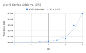
The last step is weighing a player’s championship equity using his health; if a player performed at an all-time level for 162 games but missed the entirety of the Postseason, he’s certainly not as valuable as he would’ve been if he’d been fully healthy. Thus, we use the proportion of a player’s games played in the regular season to determine the new SRS, while the percentage of Postseason games played represents the sustainability of that SRS for the second season. The health-weighted SRS is then plugged into the championship odds function to get Championship Probability Added!
Significance
With my new “World Series odds calculator,” I’ll perform evaluations on the best players in MLB history and rank the greatest careers in history. I’ll aim to rank the top-20 players ever at minimum, with a larger goal of cranking out the top-40. With this project, I hope to shed some light on these types of topics in a new manner while, hopefully, sparking discussion on a sport that deserves more coverage nowadays.
